Case Study: Conference Website
Overview
The Marketing Team requested that the 2018 4G/5G Summit Conference site be updated to match the new company branding. Since the booth and other branding would be following new standards the website must be consistent.
Problem
While the Marketing Team was primarily concerned with a consistent look and feel, they also had received feedback that attendees and presenters were not happy with the usability of the site. Users had been frustrated in previous years and as such were less likely to use the site to keep up on the latest speakers and exhibitors, thereby lowering its effectiveness as a marketing tool.
The ideal end result was to improve the look, feel, and user experience in order to make the website as useful as possible to attendees and presenters and embody the values stated in the company brand.
Existing Site Feedback
The Marketing Team consolidated feedback from users and the main issues were:
- The website was slow
- Things were hard to update
- Users found things confusings
- Site wasn’t optimized for mobile
- Agenda page wasn’t helpful
- Experience was frustrating
I reviewed the site and made some of my own observations from a user experience and visual design standpoint.
Process
User Journey
I spoke with the Marketing Team about the different types of people that would be attending the conference and came up with three types of users, First-Time Attendees, Returning Attendees, and Presenters. From there I focused Journeys the user would be taking on the site.
- Planning Attendance
- Someone planning to attend the conference will want to know basic details. Where, When, and What are the top information when deciding whether to attend. The information must be easy to find so the Attendee can plan their trip. They will want to know how to get where they are going and what they are doing each day so they can pack and plan. They want to confirm their attendance and want the process to be as easy as possible. They want updates to keep aware of events to attend.
- Solidifying Plans
- After attendance has been confirmed they will want to figure out what events to attend and where they will need to be. They will be interested in networking and gaining information, so they want to know what is going on to effectively plan each day.
- At the Conference
- During the conference a person will want to know times and places to be. They will be mobile and be able to easily look up information and get to where they are going on time.
Thought Process
One of the main complaints about the site was that it was not optimized for mobile, a no-no if you are pushing mobile technology. I discussed with the developers some strategies to use. The backend was all Drupal, so there is a concern about theming. Also, the previous agency’s code wasn’t well documented so changes were going to be a bit challenging. It was decided to use Bootstrap, and use small Sass files so the team could work on different pieces and pages.
The Branding Team did not want a whole redesign, they wanted to keep the site pages and general layout, so I did not do any wireframes but worked within the existing structure. So I proceeded straight to mockups since the Marketing Team would respond best to visuals.
I started by looking at other conference sites to see what they included, and how well the functionality worked on mobile. I took my User Journeys and used them to guide me as I navigated around each site. I made a list of things I liked and didn’t like, and what was effective and not effective.
After making my like and dislike list I and vetting all of the different content types I started to think about hierarchy of information and asked questions like “what does a user want from a conference site before and during the conference”, “what is most useful”, “what were pain points I had planning/attending a conference?”, “how did my example sites solve these problems?”
Designing the Site
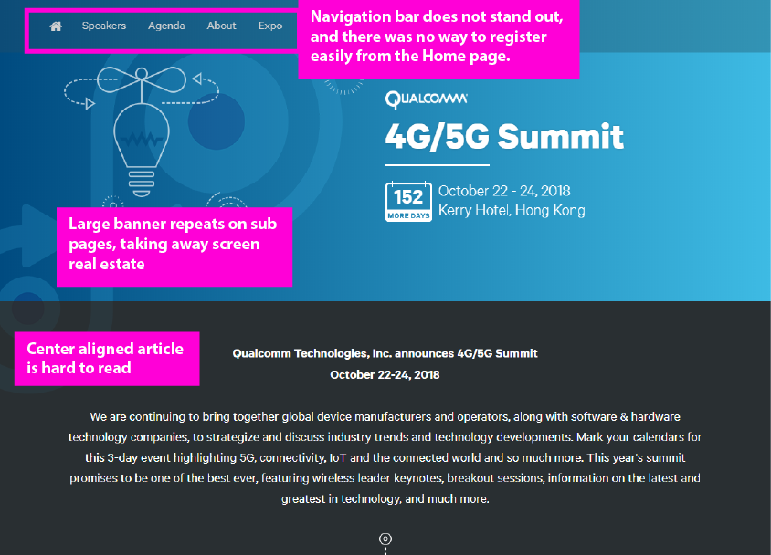
I choose the brand blue color as my main color. Creating a simple and clean banner that grabbed the viewer’s attention I also leveraged the brand’s badge imagery to create a big eye-catching Countdown to the conference. With the most important information, the date and the location, displayed prominently.
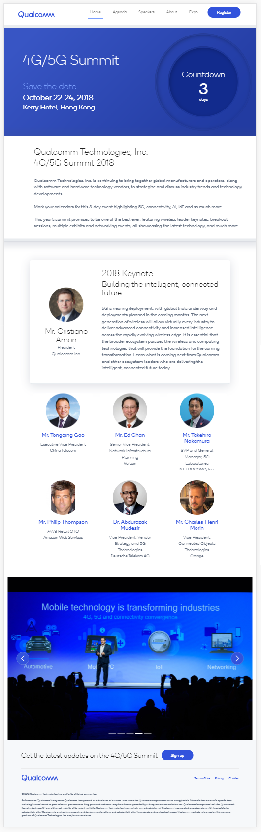
Because of the blue banner the white navigation bar is more prominent, catching the viewer’s eye and allowing them to explore other content. A bright blue Register button makes it easy for them to take action.
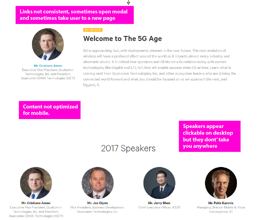
The Keynote is called out with large text labeling it as such. The speaker names are links where the viewer can read biographies and see information about their talks. The CSS was reworked using Flexbox so the section is responsive.
The gallery of photos at the bottom is responsive as well and alt-text was added.
Another call to action was added in the footer section to get the viewer to sign up for marketing emails. It is persistent across pages, something that wasn’t present on the previous site.
View the Conference site.
Thinking About Responsiveness
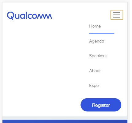
The responsiveness was planned from the beginning by thinking about how to leverage Bootstrap’s classes and Flexbox capabilities. I created the homepage using HTML and CSS and the Drupal developer was able to incorporate my work into creating a functional template.
By thinking about how this would work practically in code I made my design by thinking about how the divs would interact with each other.

As you can see here, on mobile, the countdown badge moves underneath the the conference information, and this was done by adding a min-width property to the div with the conference information. The same technique was used on the keynote as well as the speakers.
The mobile menu collapses with the standard hamburger iconography that the user should already be familiar with, and again a nice big Register button is easily accessible.
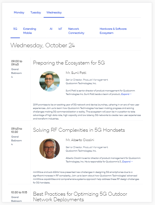
Agenda Page
The Agenda page was planned to be the biggest draw as Marketing emails would be sent out periodically to with links to content here.
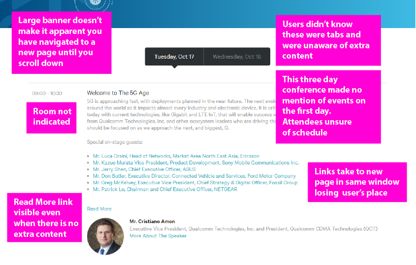
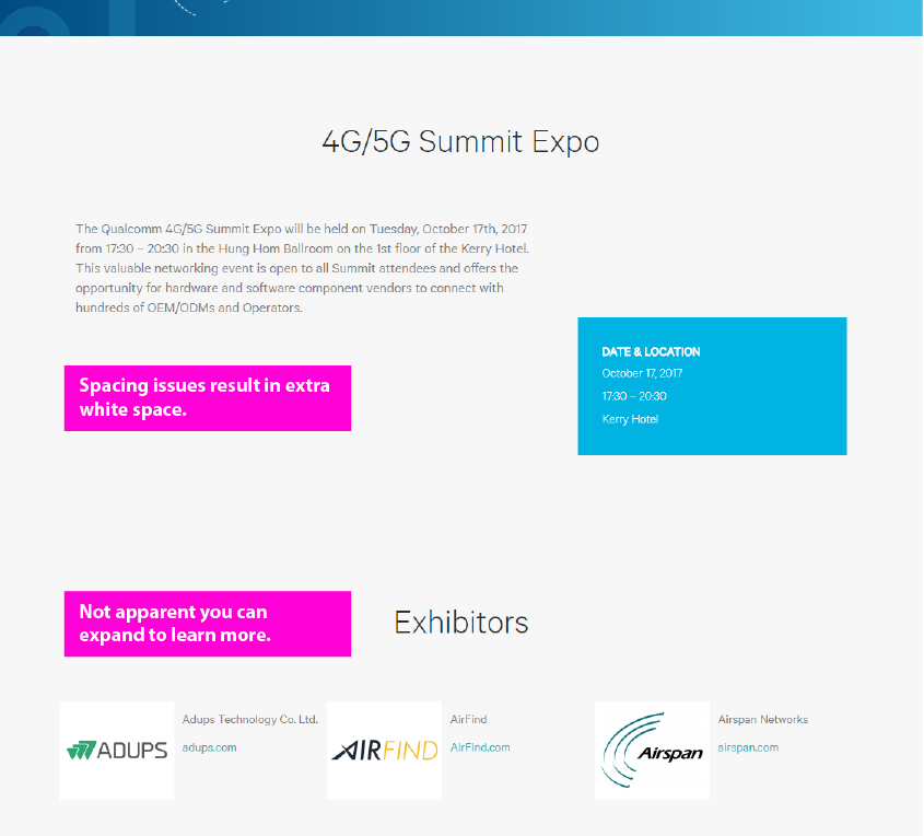
I made a design variation of the banner on the front page in case a user didn’t visit it they would still see important information. One problem called out from the previous site was users often thought links didn’t work because the previous large banner took up the whole screen it wasn’t easy to see if you had been taken to a new page. This “slim” banner met Marketing’s goal of keeping the conference information prominent while allowing the user to see they were on a new page. Now, all three days of the conference were called out. On the prior site although there were three days of events only two were mentioned on the Agenda page. I suggested to the Marketing team that there should be a blurb for each day so the attendee knows precisely what to expect. I also included Monday in the sub-navigation to re-enforce something would be happening that day.
There is only one Agenda for Tuesday, but the day is clearly called out, and the location is prominently displayed. The times are called out and standardized. The previous site had the times listed in different formats across the site. I got consensus about the format from Marketing and they agreed to write the times in xx:xx 24-hour format. I passed the information along to the whole development team so they would be aware when building Views and entering content.
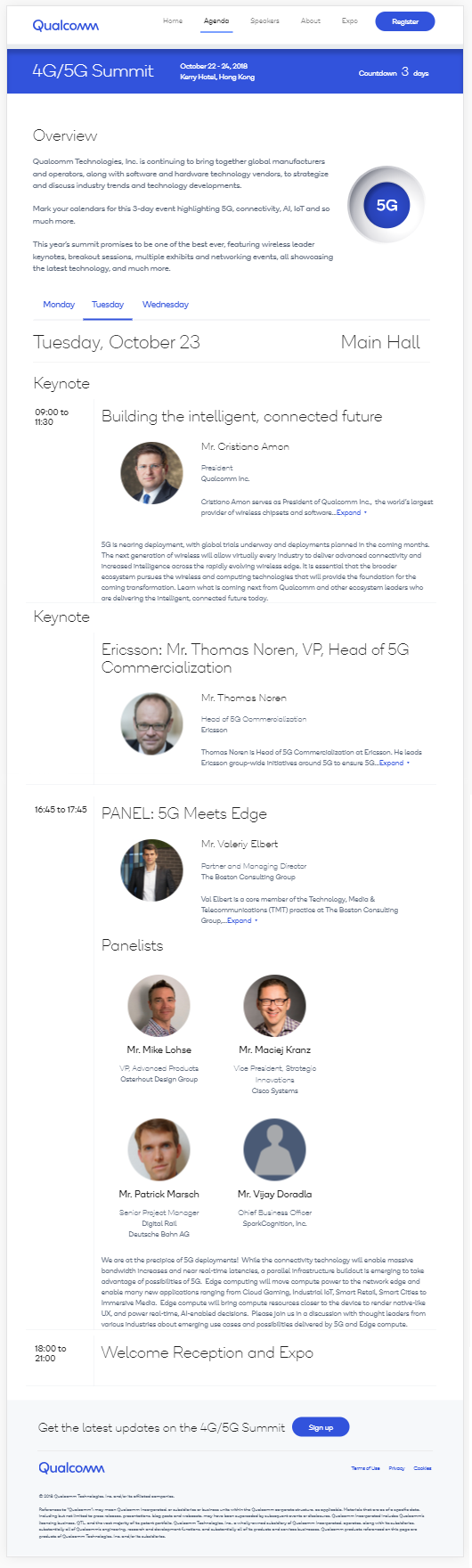
I also worked with the developer to include different categories of presenters (speaker, panelist, moderator) so their bios could be included on a panel. This was something that bothered Marketing in previous years, as only one person could have their photo on the panel and everyone else had to have links.
On Wednesday the Attendee has the option to attend different tracks depending upon their area of interest.
In the previous site everything was listed in one long list, so it was a pain point to attend whatever Track was listed last, as you had to scroll all the way to the bottom of the screen. Locations were also not listed so attendees were confused and found this page lacking while they were at the conference.
I worked with the Developer to see if we could nest tabs inside of other tabs, and fortunately we could.
Now, the attendee can click the tab for the Track they are attending, easily see the time, location, and overview of each panel. I thought about my own wants when attending a conference, I want to know when and where I need to be!
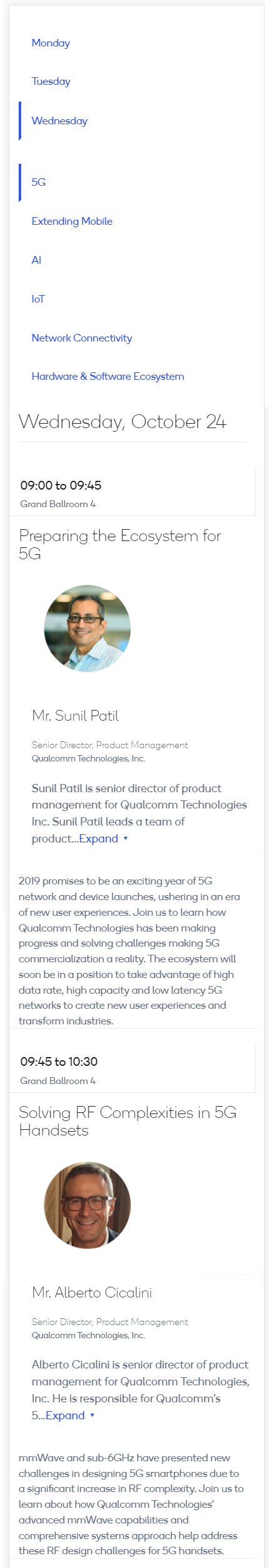
The page, while not as elegant on mobile, is still useful with the information stacking neatly in a long vertical scroll. The previous page required a horizontal scroll, which isn’t a standard pattern for mobile users. Best of all, if the attendee chooses to view another Track, it doesn’t take them to another page as previously, but hides and reveals content, thereby “keeping their place”.
I also worked with the Marketing Team to distill down their Track titles into areas of interest. In prior years the Track titles were long and hard to remember. Now, they are short and get to the point, so attendees can more easily remember what area they were interested in and what it corresponds to. Something valuable when attending a fast-paced conference trying to look things up on a phone.
About Page
The About page was reworked, and the information organized into more logical groupings. One thing the Marketing team noted was that people were confused about the Expo and Networking, where was it? Was it separate?
In order to help give context to attendees it was included on the Agenda page and given a time slot and location. It is occurs on Tuesday and with that change it appears more like a part of the overall event. You can see here that it is grouped with the Summit info.
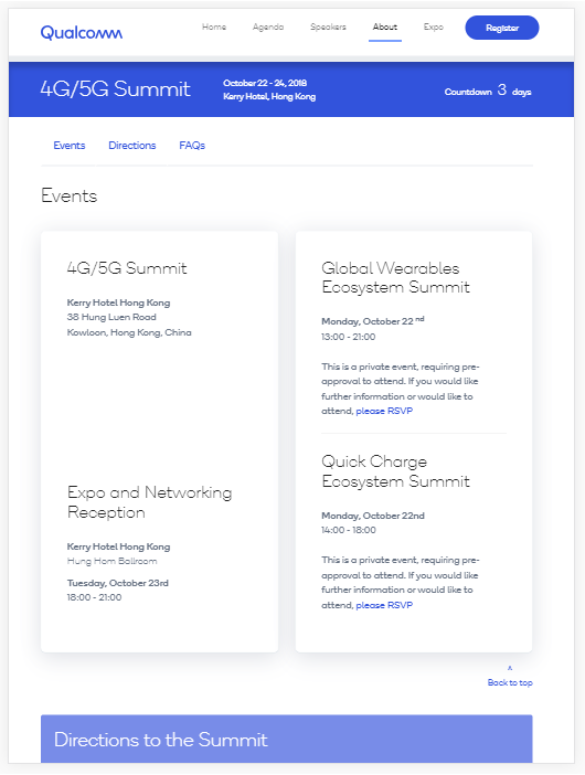
On the right hand side are related events. I put emphasis on the dates to help people understand these are separate events, and had marketing call out that people needed to be pre-registered, something that wasn’t included on the previous site.
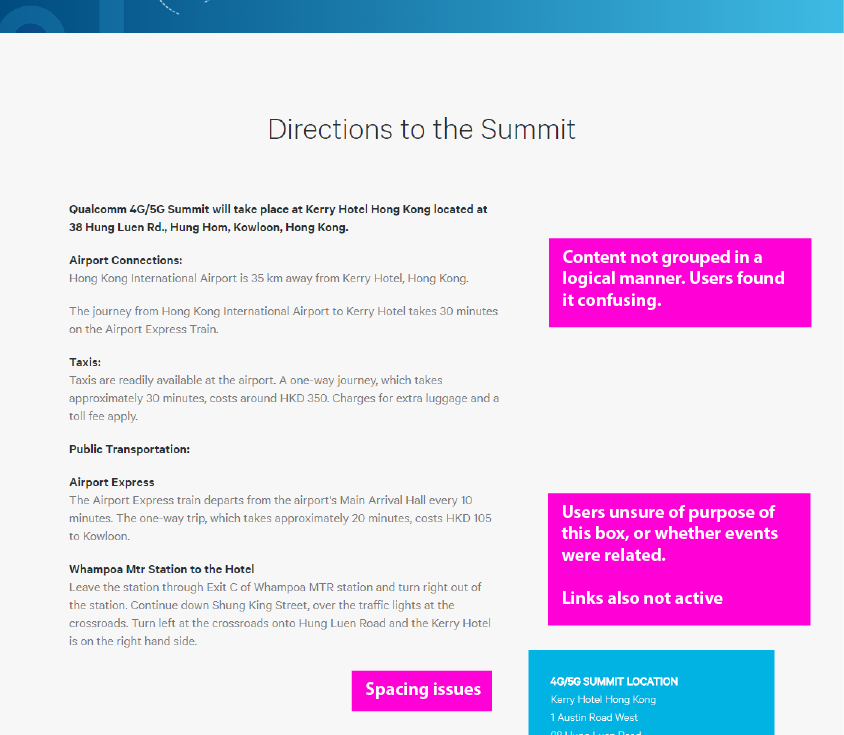
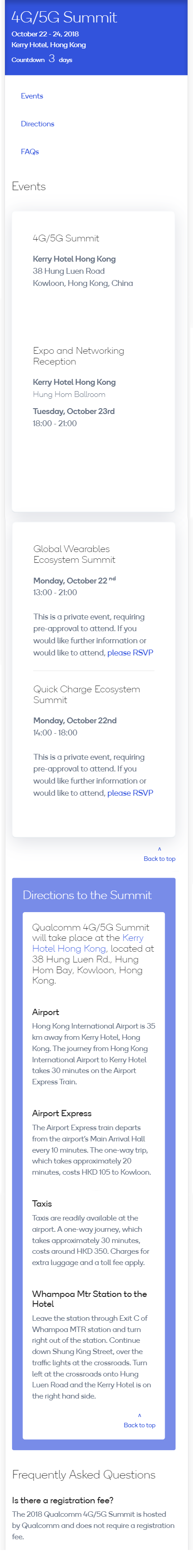
On the top there are in page links that take a user to the section of the page they may need at that time, instead of making them scroll down and hope the information is there. Also, back to top links, in case they want to view another section. Again, I was thinking about other people’s experience with conferences. When decided to attend a conference you want to know when it is, where it is, how to get there, and see if there are any questions. Initially, the site went up with just the Home page and the About page available so this page had to be as useful as possible. The Directions section was reorganized into more logical sections, and wordsmithed to be more clear. Also a small thing with big impact the name of the hotel is hyperlinked to map directions to help assist the user finding their way.
Results
Overall the Marketing Team was very happy with the changes, and the site got approved by the Branding Department. Responsiveness was built in from the beginning by thinking about how best to use Bootstrap’s framework.
The conference has not yet occured so I have no feedback beyond the team who built and reviewed it. I did make sure to address as many of the functional issues noted by the Marketing team as well as what I found while testing and vetting the initial site. I am hoping the mobile responsiveness and Agenda page are the biggest wins, and are the most useful to the conference Attendees.
Takeaways
- Contrast is a good way to draw attention to different elements on a page
- See what other people are doing and get a sense of what you like and don’t like
- Think about what a pain point was for yourself
- Think about content, don't be afraid to ask for rewrites
- Roleplay as you make mockups
- Don’t be afraid to ask questions from your client if something is unclear, they may not understand something is not obvious
- Add small touches
- Simple can be effective