Deanna Brigman Heine
UI/XD
Case Study: Conference
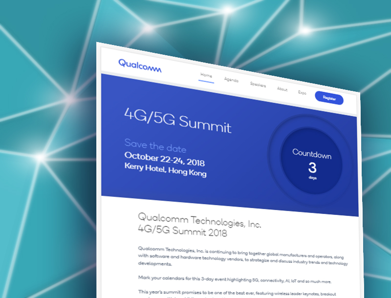
The conference website needed to be updated to match company branding, and overall usability needed to be improved. I partnered with Marketing to make improvements to the site.
Case Study: Notifications

Users found the project management system emails confusing and opted to instead contact the system support team to complete their tasks. I partnered with the support and technical teams to develop a solution to alleviate the support team's workload.
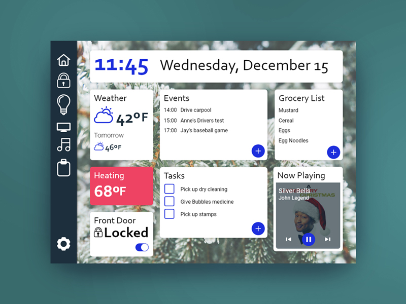
A dashboard for a Home Control app. It has options for customizing the content shown on screen so the user always has the most important content available.
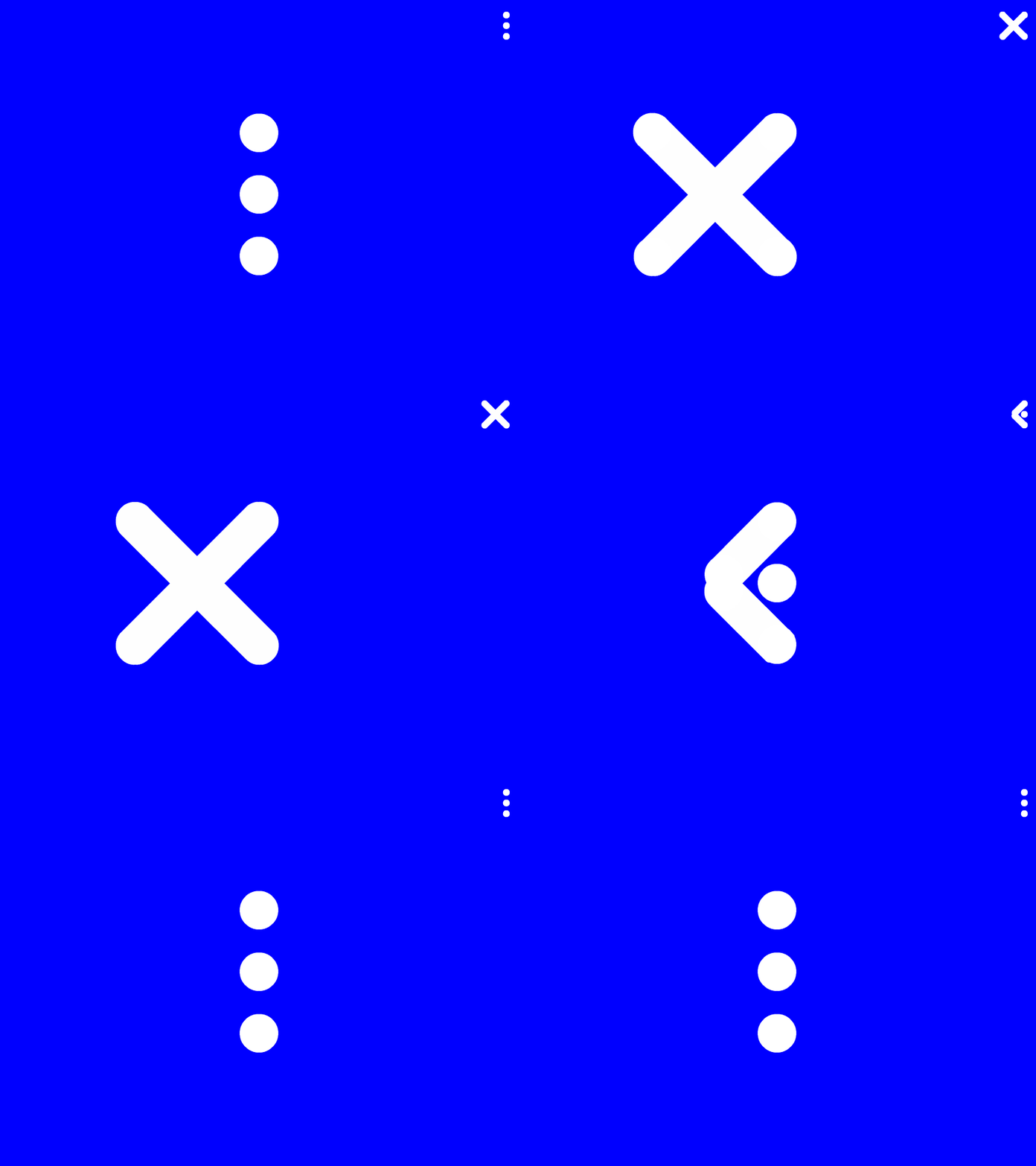
An open and close micro-interaction animation. The elipsis menu transforms into a close button when the user opens the menu.
A location tracker where you can share and view friend's locations in real time. It includes the option to navigate to them, and see where they have been over a set interval. The option to stop sharing is presented in easy reach at all times.
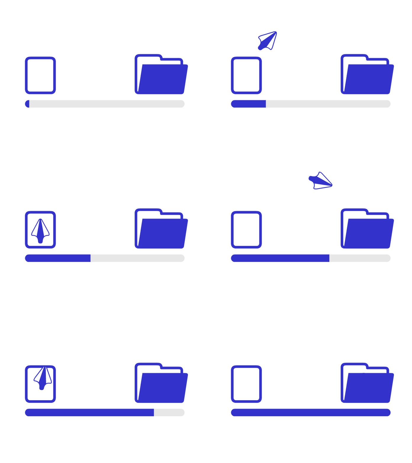
File transfer upload animation. The file from a tablet transforms into a paper airplane as it is sent to the destination.
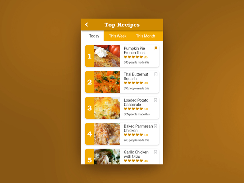
A top recipes leaderboard. The assumption is users can see what other people have liked or are making to help give them ideas for their own meal planning. I used bright orange and large numbers to make it approachable and optimistic.

A document being uploaded to the cloud. Can easily incorporate a status percentage to advise the user of progress. The document graphic can also be swapped out to indicate other file types.
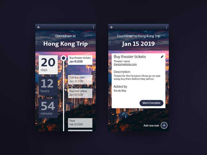
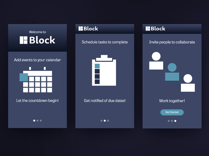
Countdown app that functions as a calendar and task manager. The concept is that you enter an event and items that need to be completed before the event. For example, a trip abroad. This can include exchanging currency, arranging transportation, etc. Then, see a timeline of activities that need to be completed and get notifications as tasks are due. The app also allows you to collaborate with others. I created all the assets and design details for this.
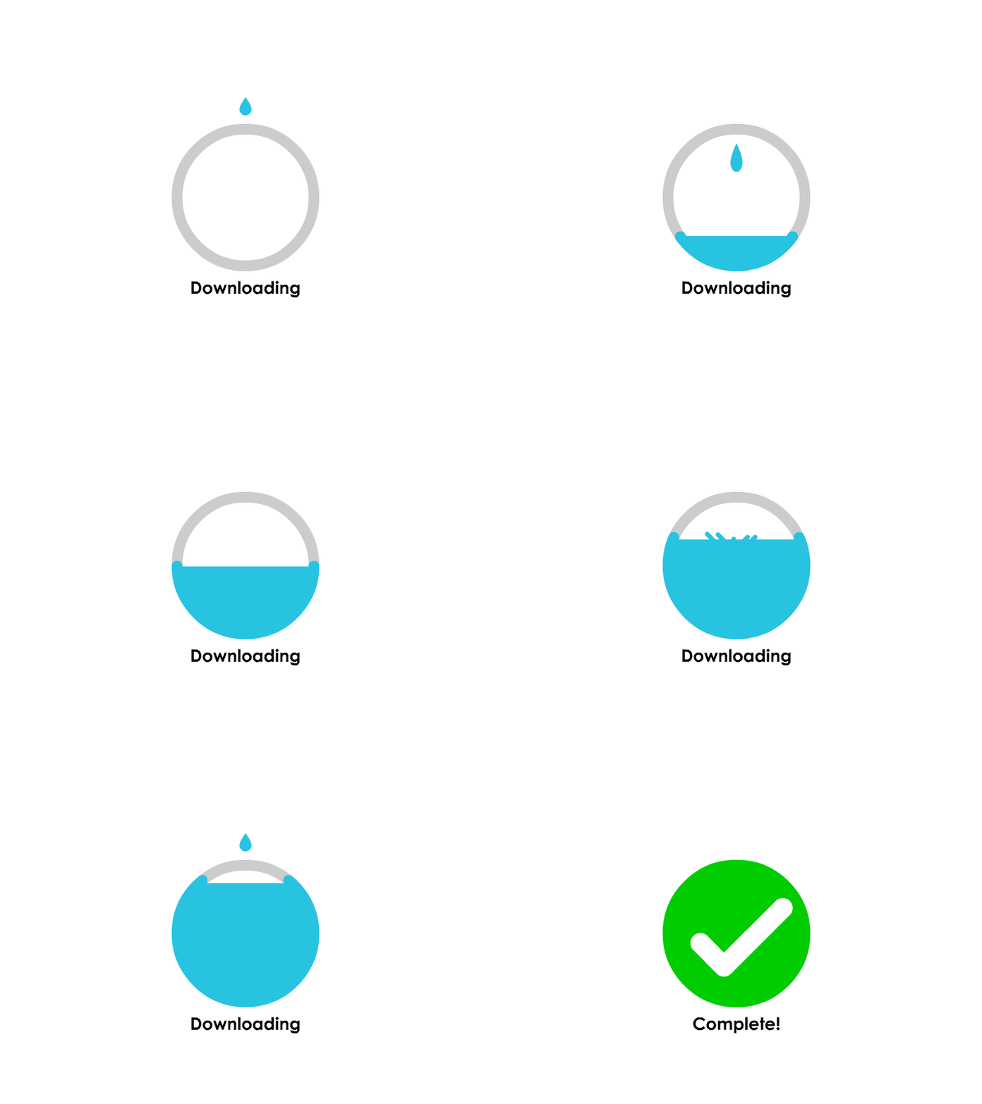
A downloading animation incorporated with a success graphic when the download is complete.
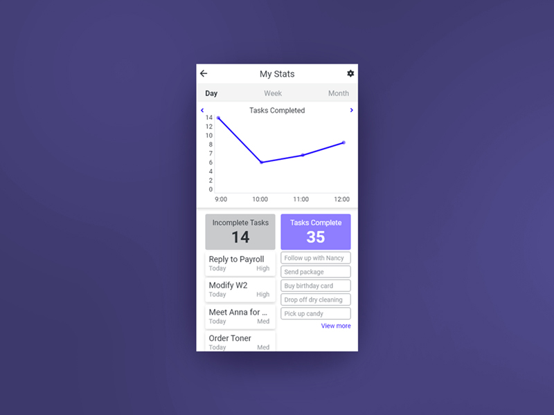
Stats dashboard for a task manager app. It is focused on productivity and in this example you can see the tasks you have completed over the day. This is for those task oriented people who enjoy checklists and the satisfaction of getting things done.
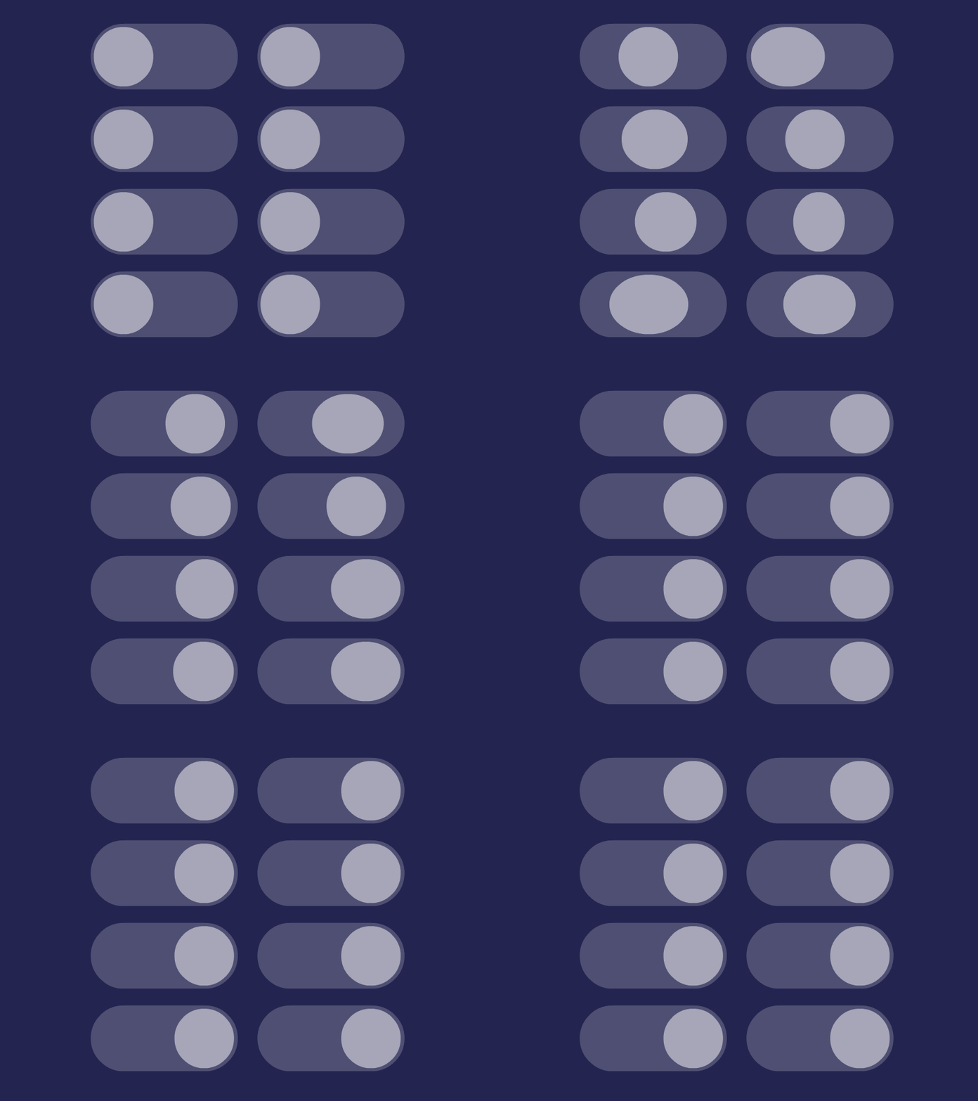
Toggle button animations showing what you can do with the same amount of frames and how the percieved character can change with minor variations.
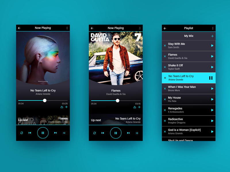
Music Player app with a focus on playlists. A dark color scheme was chosen to give a modern feel and save battery life. A large play button is the focus with the ability to see the next song so the user can skip with confidence.
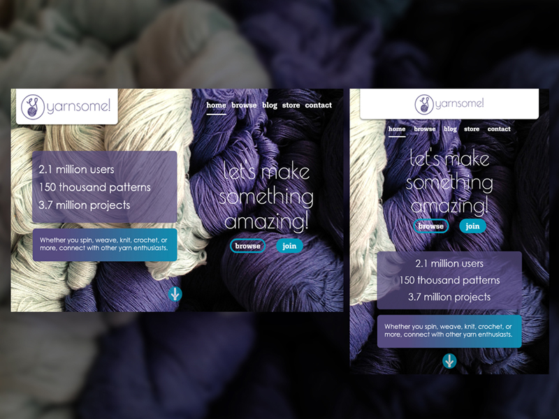
"Above the fold" landing page for a yarn enthusiast site similar to ravelry. Where users can find patterns, post their work, and interact with the community. I based the concept around the stock photo of the yarn. I created the color palette, designed the logo, wrote the copy, and did the overall design. Click through to see designs for different screen sizes.
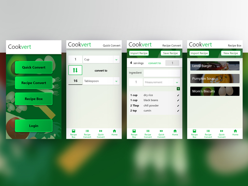
Cooking calculator/converion application. The app has the option to convert individual measurements, or entire recipes. The user can also save recipes and convert by number of servings. View the prototype
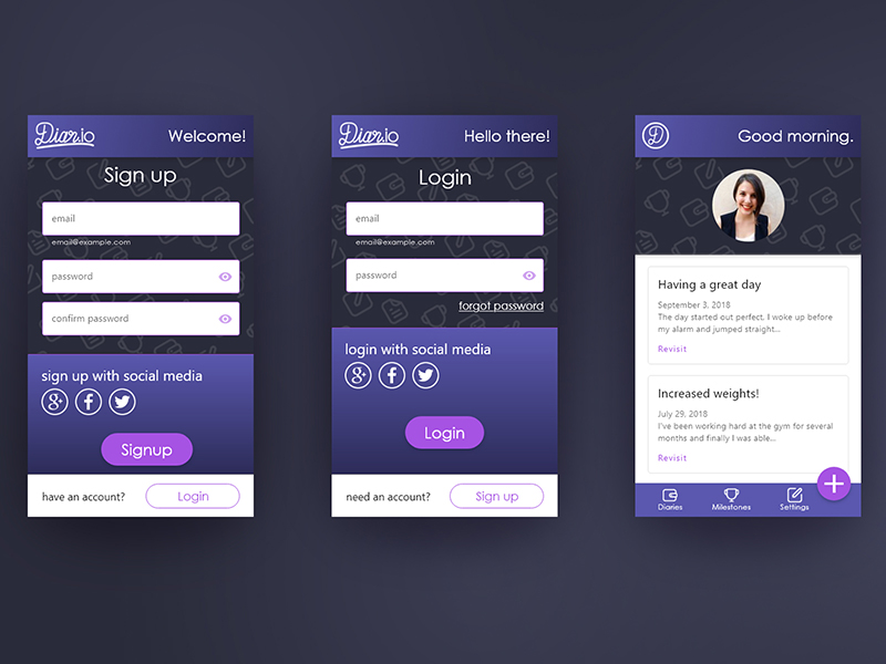
Signup and login page mockup created in Adobe XD. I prefer being able to login with an existing social media account, or at the very least with an email address as opposed to having to create a unique username and have to remember it.
I created the logo, picked the color palette, and designed the overall look and feel, though the icons are from pre-existing sets created by other artists. View a simple prototype of the login process.
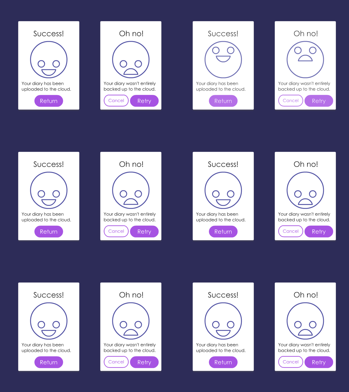
Flash message animation. The face is looking at the main success or failure message then looks down at the explanation, helping to guide the viewer's eye.

Share micro-interaction. On press the sharing options bounce out to draw the user's eye. Upon second press or after sharing the main button expands to pull the smaller sharing buttons back in. Created with Adobe Animate.
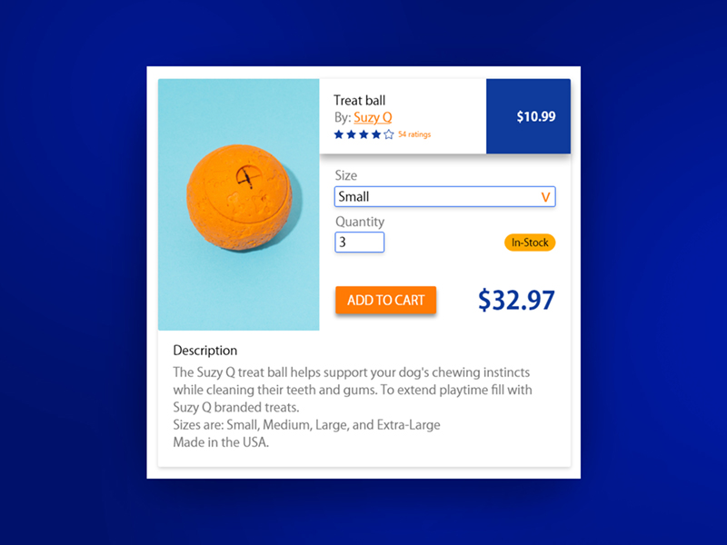
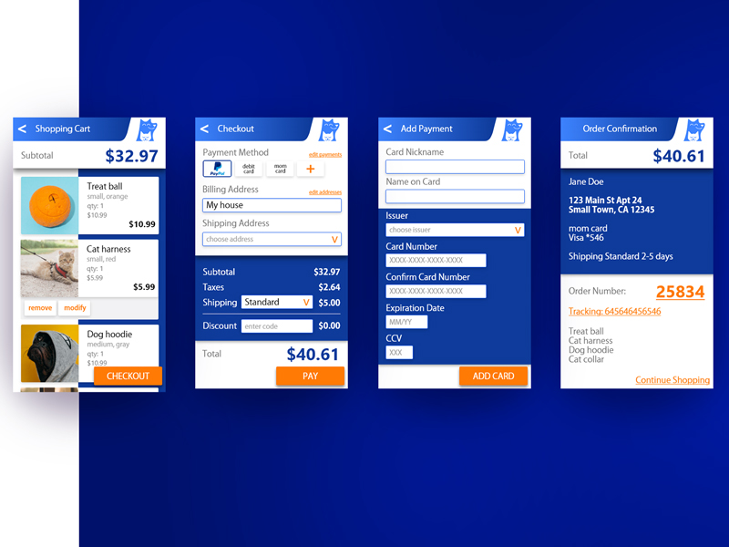
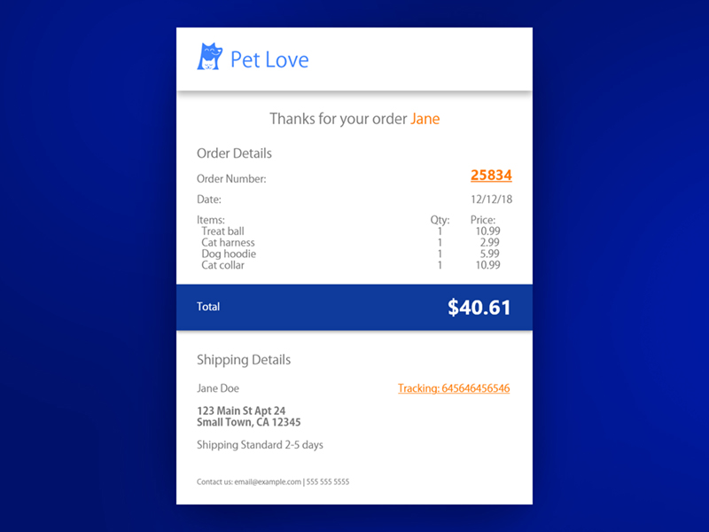
Checkout process for a pet toy and accessories app. Focused on returning customers with customization, which allows them to give addresses and cards nicknames for better recall.
I created the overall design, picked the color palette and designed the logo. View a simple prototype of the checkout process.
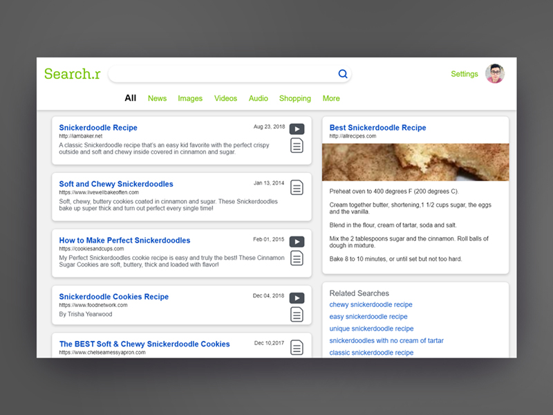
Example search results page. Priority is given to notating the type of content the site contains, as well as a date and simple URL.
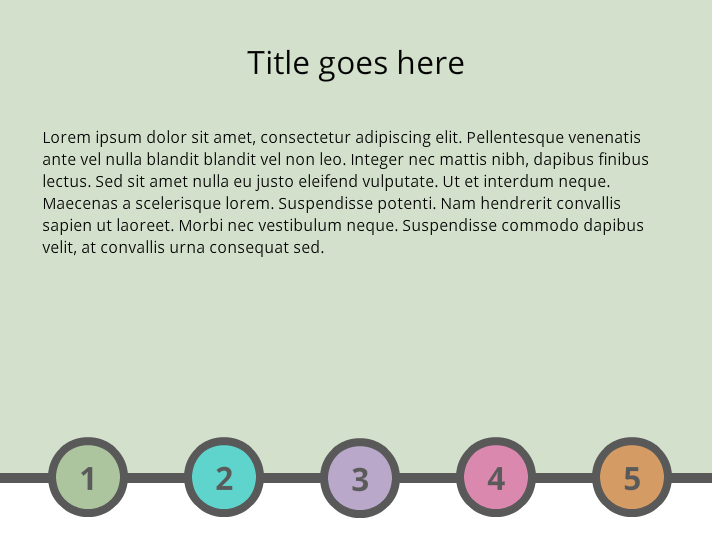
User Interface Design: Interactive tab exploration
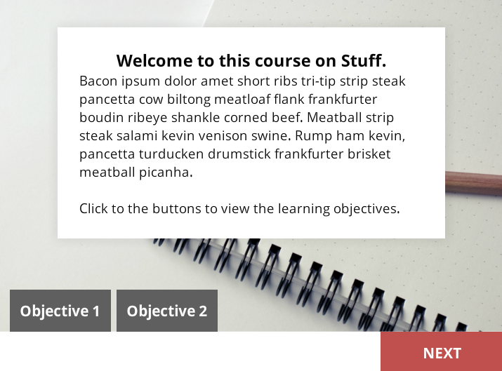
User Interface Design: Course gating example
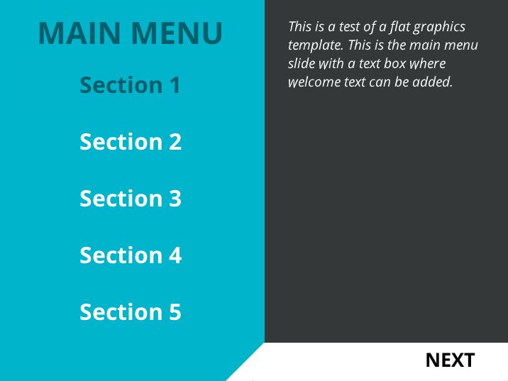
User Interface Design: Simple course slide design
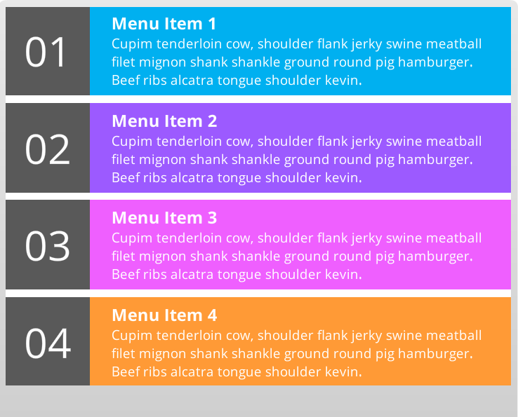
User Interface Design: Course menu and navigation example