Design Process: Login process for Diary app
Overview
Design a login page for a diary app and a flow for the process.
Brief
Login and Sign up pages are the something everyone is familiar with, but how do you make sure they are usable while also injecting personality.
Process
Sketching
The first step was to design a flow. It seems like such a simple page task but it is always important to think things through, so in the design phase you account for everything that needs to be presented and get answers to your functionality questions.
I went to paper and started sketching out what I thought should be on screen. I always think better when I am sketching! For a sign up page an option for an email and a password obviously, but also included the option for signing up with existing social media accounts. As we become more and more submerged in the online world we become inundated with usernames, and passwords and it becomes harder and harder to remember them all without a password manager. In an app that won’t have a social or community aspect to it there really isn’t a need for a username so no sense in making the user come up with one.
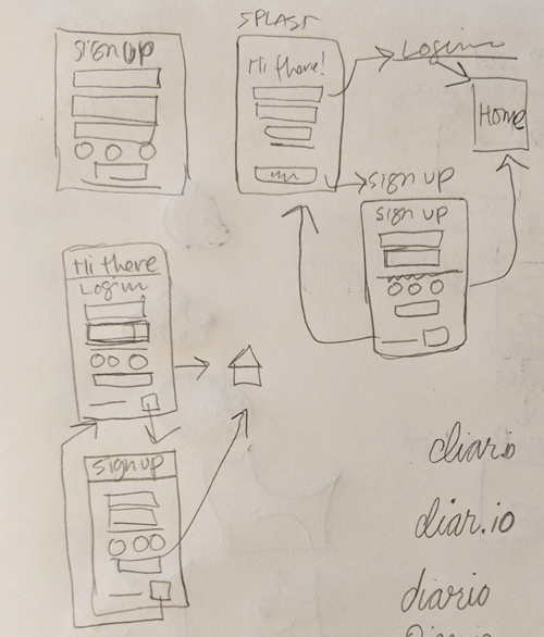
My thinking is, use an email and on the backend tie the account to some other data that is independent from the email and a username. In giving the option to sign up with an existing social media account you make the process simpler for the user.
I initially had a splash page come first, but decided to get rid of it since it is an extra click that doesn’t really add value. So instead I decided it would default on the login page with a link to sign up readily available.
Wireframes
I started by sketching some quick layouts based on the patterns I saw during my research to determine what might work best for the landing page. The basic layouts really came in three options, logo and navigation on the top, with the call to action buttons in the space below. I knew I wanted a balance between a look that would appeal to the younger audience and one that would appeal to the older audience. So, I decided against any unconventional layouts despite their popularity.
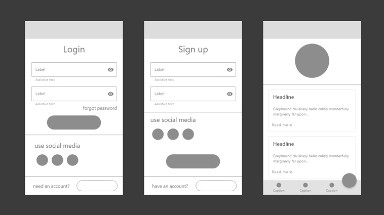
Here are the wireframes I came up with. A top bar for the logo and branding elements. A big text field that tells you the purpose of the page, and the fields for the user to fill out, and the option to use social media. I decided to put the fields first and social media signup later, since having fields would prime the user to the function of the page. Nice big buttons, and the option at the bottom to switch between sign up and logout. Then a simple welcome page for prototype purposes.
Design
I began with a color palette. Since this was a diary app I wanted it to elicit friendliness but also the personal secretive nature of a diary. So I choose a blue violet and a dark background color. For contrast for buttons I chose a pinkish-purple. It spoke to me as being a bit mysterious but also approachable.
Given the personal nature of the app, I wanted something round and friendly and ended up on Century Gothic. I also made the decision to use lowercase for some of the text to make it seem more informal, this was also reflected in the phrasing for the copy.
Final Design
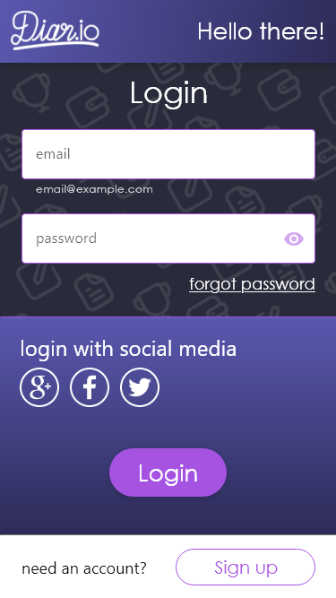
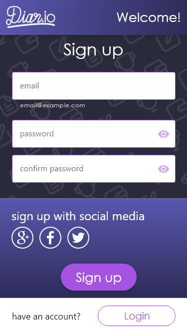
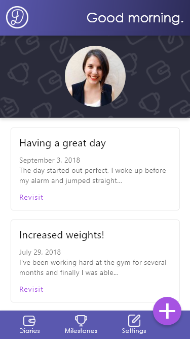
I used gradients to give a bit of depth and interest to the blocks of color. I also found an icon set of diary and writing related imagery to make a repeating pattern to give the dark near-black background a bit of visual interest. I decided upon line art style icons to mimic the written logo treatment.
Takeaways
- Color can tell a story
- Keep interface language consistent
- Take out unnecessary clicks
- Focus on layout and content first