Design Process: Landing Page for Craft Site
Overview
Design a landing page for a yarn based community site, with a logo, color palette, and overall look and feel.
Brief
Give the site a modern but approachable feel. Key ideas:
- warm
- open
- friendly
- pretty
Process
Research
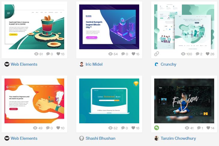
The first step was looking at inspiration, what are some landing page designs on Dribbble, what are the trends? Trends I noticed included:
- white space
- colorful gradients
- custom illustrations
- color blocking
- large photo background
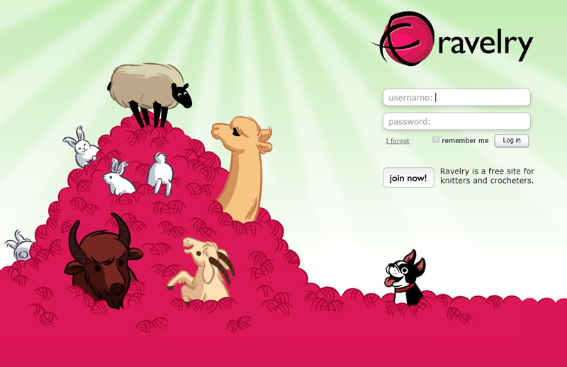
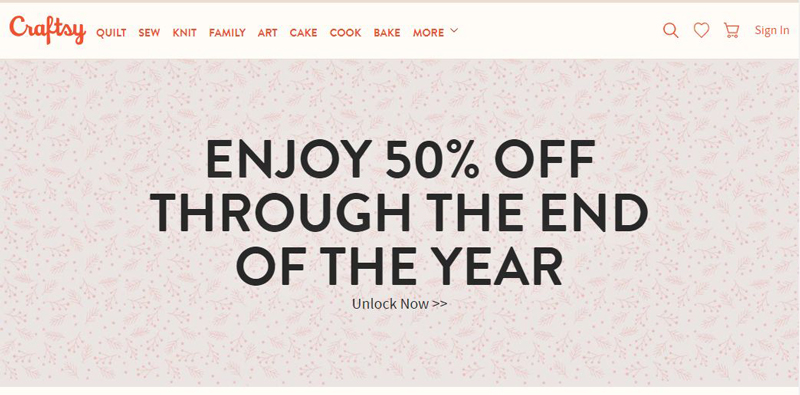
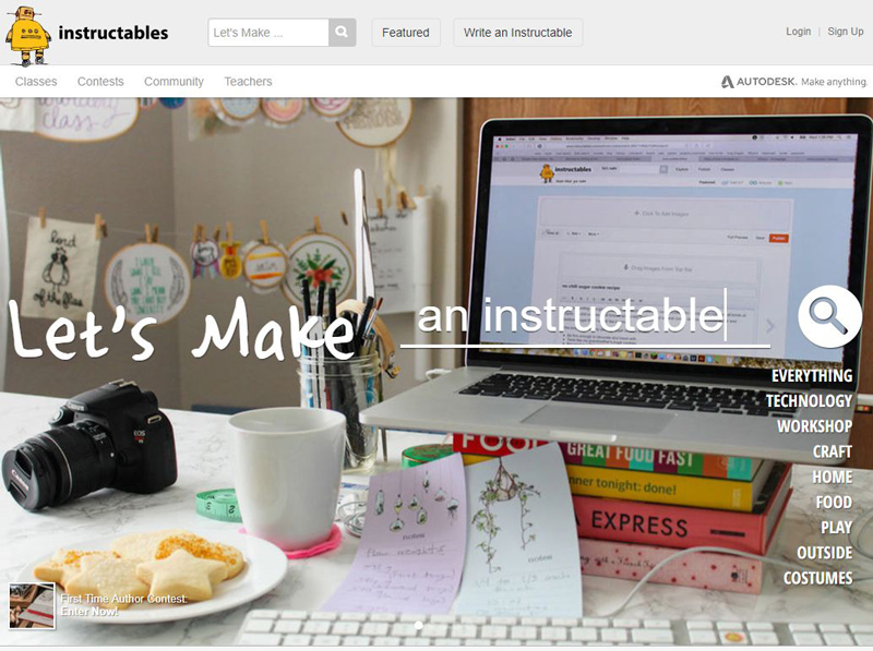
I also took a look at some craft sites like: Ravelry, Craftsy, and Instructables.
Ideation
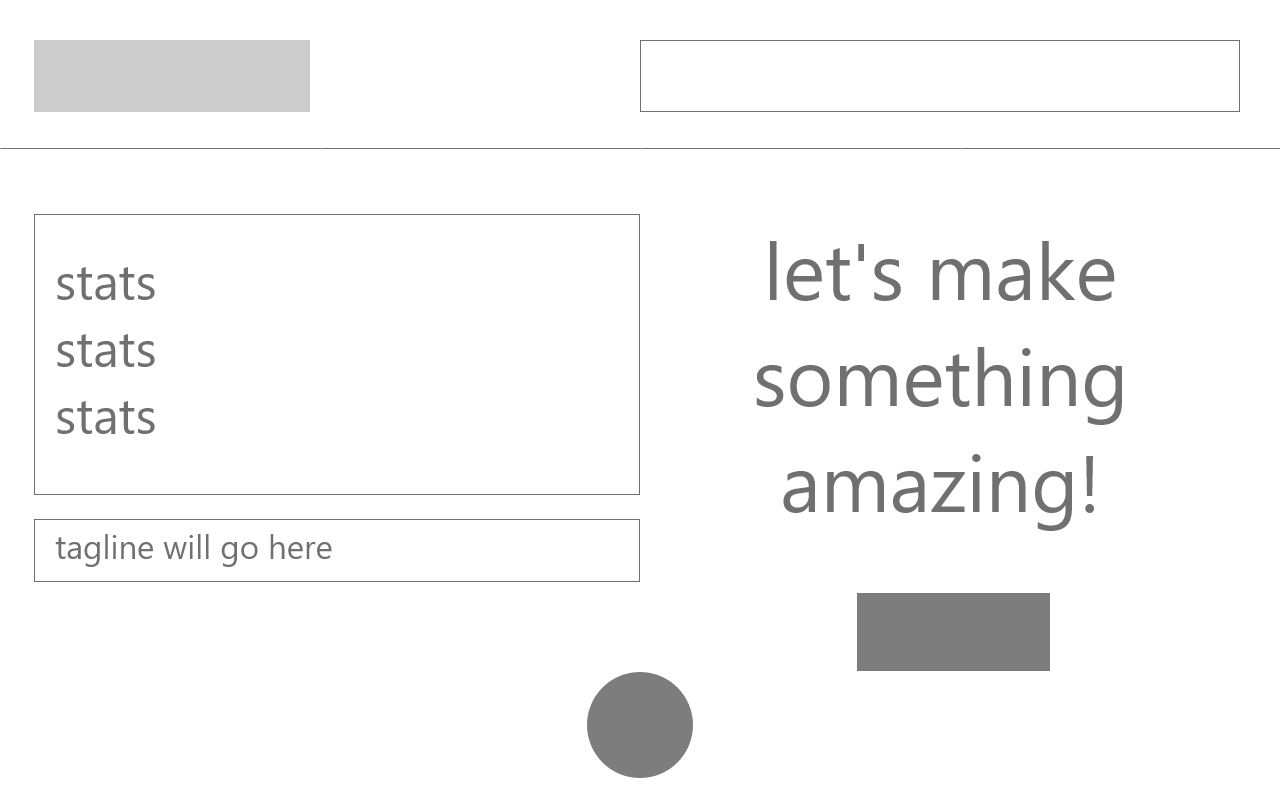
I started by sketching some quick layouts based on the patterns I saw during my research to determine what might work best for the landing page. The basic layouts really came in three options, logo and navigation on the top, with the call to action buttons in the space below. I knew I wanted a balance between a look that would appeal to the younger audience and one that would appeal to the older audience. So, I decided against any unconventional layouts despite their popularity.

Next I began to ideate on what the background would be: a solid color, a photo, gradient, or custom illustration. After brainstorming some ideas I decided that a colorful photo would be the best, it would “tell the story” of the site without coming across as being too young.
With that in mind, I did a quick wireframe of layout I thought would work given the information I had.
Design
The next step was to begin the search for a photograph that would help drive the color palette for the site. It was narrowed down to one great option from Unsplash.
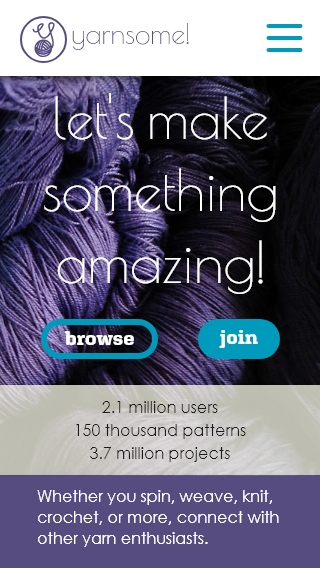
I loved the rich luxe purple contrasted with the light yarn with a hint of yellow, that sort of gave it a “raw” quality. Also having skeins of yarn made me think of shopping for new yarn, and all its possibilities. I was hoping visitors would feel the same way. Coupled with the tagline: Let’s make something awesome! That it would help the call to action pop, and get the user excited to start their next project.
The main purple was pretty easy to nail down, as it was sampled from the photo, the next challenge was to develop the rest of the palette.

I chose a bright blue to contrast the classy purple, and chose a soft beige for backgrounds. White for contrast and a not-quite-black for main page text.
Next was the typography.
I chose Poiret One for the round single weight letterforms. The generous curves made me think “friendly but elegant”. My intention is that it will only be used sparingly, in the logo and in the tagline. I chose Aglet Slab for the navigation and because it was a good contrast against the delicate Poiret One. It still gave me the same friendly feeling, and had many of the same design elements so they looked like they belonged together. Finally, I choose Century Gothic as the main content font, and the fallback for the others since its look and feel is closest to my decorative font, and has comfortable readability.

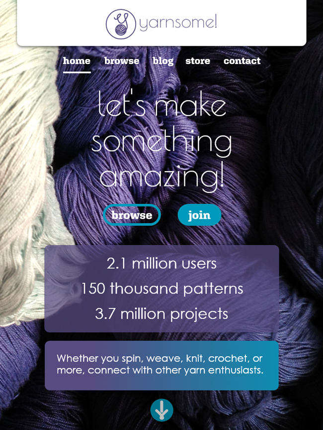
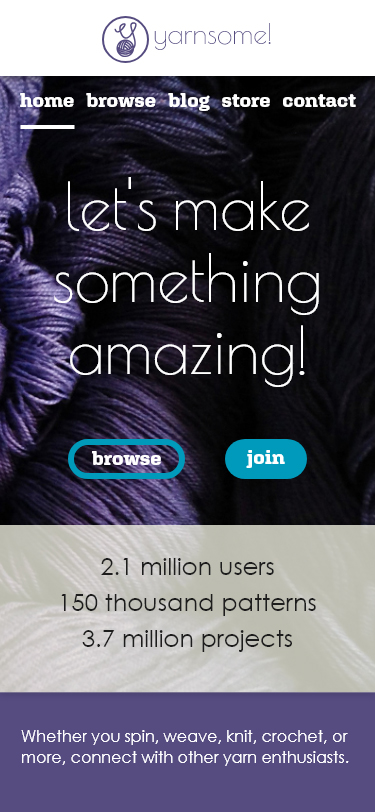
Then, on to putting it all together. I decided to use multiples of 4, leaning on 8 for all the measurements, because I have found that scales well. I started with the desktop layout first, but always keeping in mind what it might look like on mobile.
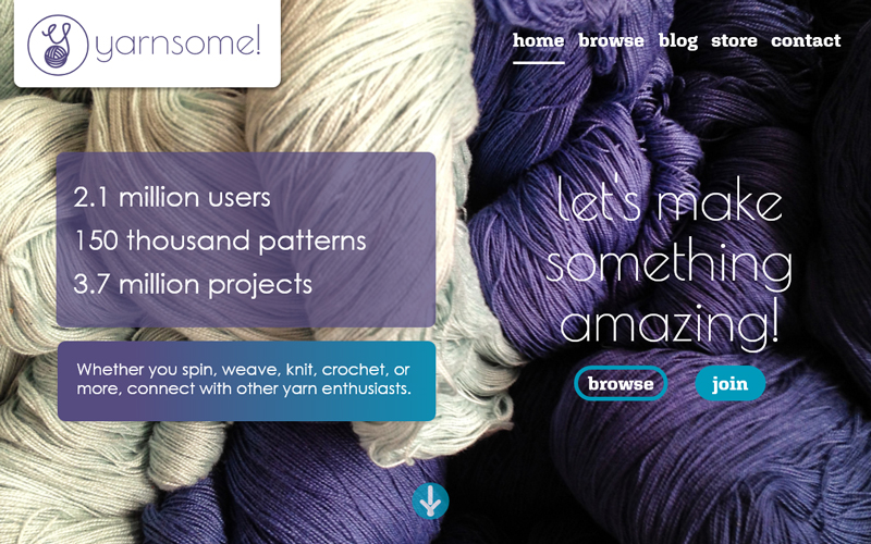
The right side of the design came together quite quickly. Once all the content was in the fonts applied and colors blocked in, the font sizes and placement were easy to figure out. The left side took me some time. Initially, I went with a large color block on the left side, but part way through I realized it was covering up the light yarn which I had specifically chosen this photograph for.
I was also fixated on using an overlapping “on-trend” layout for some reason, but couldn’t get it to work. So I scrapped that and went back to basics. Ultimately, this site is at the service of the users, not a fine art piece so no need to be avant garde. Once I got over myself the design started to fall into place. I did put a gradient on the bottom box to help lead the eye to the CTAs. I also made a custom button graphic to mimic the logo linework.
Final Design
Takeaways
- Look for inspiration, see how others have solved problems
- Not every design has to be super trendy
- Use subtle design details to guide the user’s eye
- Think about the story behind your imagery